The Story of a Storm - Part 1: Visualising Climate Data with NASA’s Giovanni Tool
In this first of two guides on visualising climate, conflict, and displacement data, we’ll show you how to turn raw climate data into visualisations using NASA’s Giovanni tool. In part two, we’ll focus on bringing in conflict and displacement data.
Climate change, conflict, and displacement are increasingly interconnected. As extreme weather events increase, resources grow scarce, intensifying social and political tensions and often forcing communities from their homes.
For example, in Ukraine, harsh winter months amplify the challenges faced by communities already burdened by war. This is especially evident in so-called “cold spots” where extreme temperatures, combined with damaged infrastructure, worsen conditions for vulnerable populations such as the elderly and those displaced by violence.
In Sudan, last year’s heavy rains triggered the collapse of the Arbaat Dam, unleashing devastating floods on communities already uprooted by conflict. For families who had fled violence, the floods turned displacement into disaster, amplifying health risks and food insecurity.
As researchers and investigators, how can we best visualise these dynamics to understand their impact on populations and effectively communicate their urgency to a global audience?
Data visualisations hold the key. They go beyond just mapping weather patterns; they tell stories of cascading risks, conflict hotspots, displaced populations, and the spatial-temporal footprints of disasters.
Take Cyclone Kenneth, for example. In April 2019, making landfall as a Category 4 cyclone, Kenneth brought torrential rains, leading to catastrophic flooding and landslides that displaced thousands. Compounding the devastation, Cabo Delgado was already facing a humanitarian crisis due to ongoing armed conflict.
The GIF below visualises the rainfall pattern of Cyclone Kenneth, highlighting its path and impact.
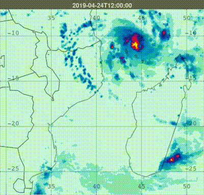
Let’s walk through a step-by-step example using Cyclone Kenneth to demonstrate how tools like NASA’s Giovanni can map the invisible forces driving these disasters, bringing the climate component of your analysis into sharp focus.
Where to Begin?
Before diving into data tools, take a moment to frame your approach. Every impactful investigation starts with the right questions:
- What’s the event?
(Context and background – was it a cyclone, drought, heatwave, or other hazard? Who was affected?) - Where did it happen?
(Define spatial boundaries – a city, a province, or a specific community?) - When did it happen?
(Set temporal boundaries – a single day, a season, or a longer trend?) - What climate indicators tell the story?
(Select key indicators – precipitation, temperature anomalies, wind speeds, etc.)
With these answers in mind, you’re ready to dive into the data.
What is NASA’s Giovanni Tool?
NASA’s Giovanni (Geospatial Interactive Online Visualisation and Analysis Infrastructure) is a free, web-based tool that makes it easy to access, visualise, and analyse Earth science data without specialised software or coding.
Hosted by NASA’s GES DISC, it offers a wide range of satellite-derived data, including precipitation, temperature, aerosols, soil moisture, and vegetation indices. Users can create maps, time series plots, and anomaly analyses, customising spatial and temporal parameters to explore patterns and impacts of climate events. Whether tracking storms or mapping droughts, Giovanni turns complex data into clear, actionable insights.
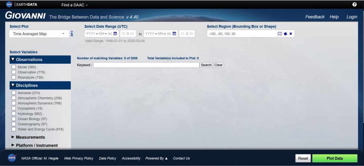
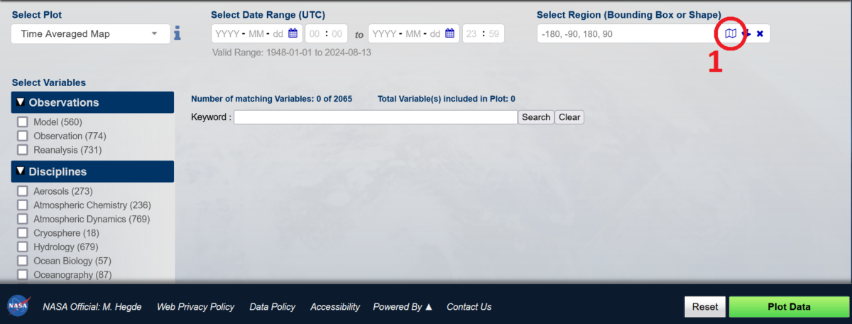
To get started with the tool, navigate to the top right, click ‘Login,’ and register to create a free user account, which grants access to all tool functions. The available datasets, covering a wide range of variables, can be explored and filtered using the ‘Select Variables’ pane on the left side of the homepage.
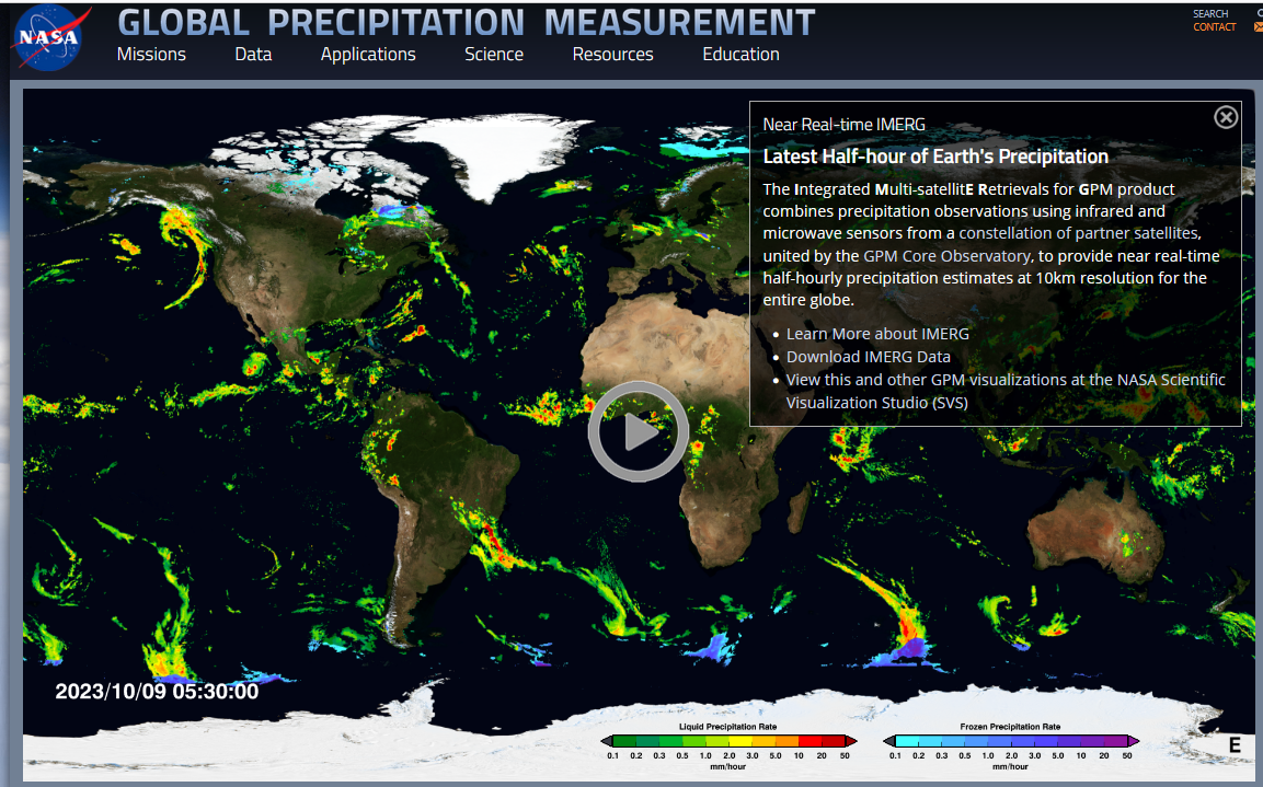
In this guide, we will use the NASA Global Precipitation Measurement (GPM) dataset to visualise rainfall patterns. This dataset provides high-resolution, near-real-time precipitation estimates using satellite observations. Offering global coverage and improved accuracy over land and ocean, it is ideal for mapping cyclone rainfall intensity and distribution.
Visualisation I: How Does this Climate-Related Event Compare to Previous Years?
By visualising trends over time, we can detect anomalies. Creating a recurring time series graph allows us to compare any rainfall event with past patterns. Such climate-related extreme events are unusual, meaning the affected areas and communities often have little to no prior experience in dealing with them.
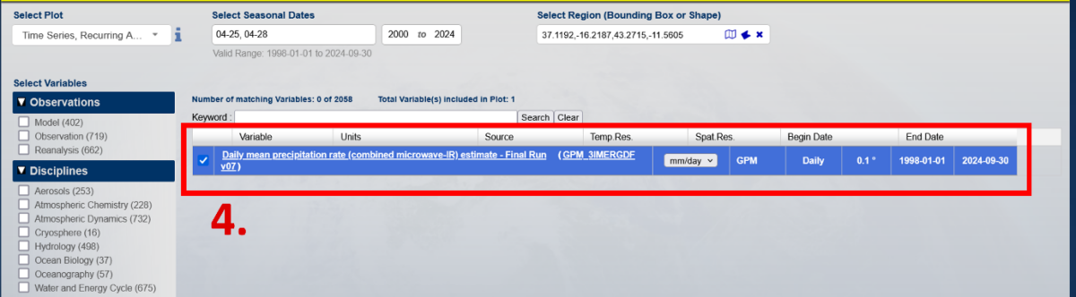
Define data specifics (see red boxes below):
- Select Plot: Time Series, Recurring Averages
- Select Seasonal Dates: 04-25, 04-28, 2000 – 2024
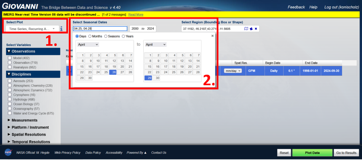
3. Select Region: Focus on coastal area of Cabo Delgado (e.g., bounding points: 37.1192,-16.2187,43.2715,-11.5605)
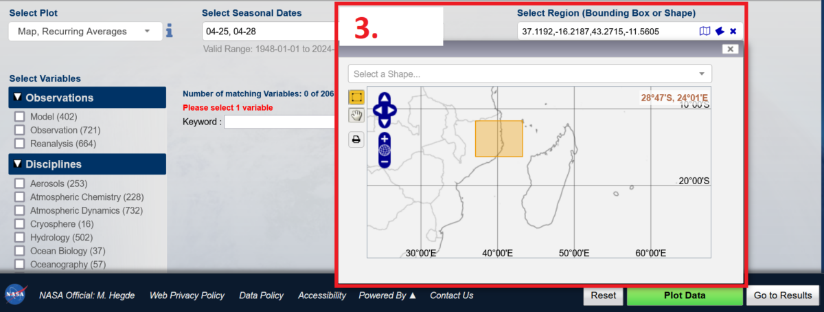
4. Select data set: Search for the Keyword, ‘IMERG Daily’ and select Daily mean precipitation rate (combined microwave-IR) estimate – Final Run (GPM_3IMERGDF v07)
Export Graph
- Select Export Options
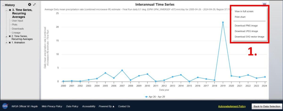
Final Export
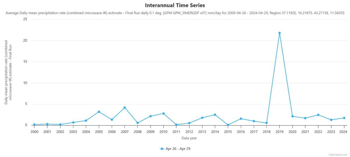
The exported chart, shown above, illustrates the average daily precipitation rates in the coastal areas of Cabo Delgado from April 26-29, 2000-2024. The sharp peak in 2019 marks Cyclone Kenneth’s impact, showing an extreme deviation from historical rainfall levels for this time of year. The average daily mean precipitation reached 21.8 mm/day during those dates in 2019, while the maximum recorded amount in any other year from 2000-2024 was 4.2 mm/day in 2007.
While communities are generally well-adapted to regular seasonal weather variations, events of this magnitude fall far outside the expected range, making preparedness and response far more challenging.
Visualisation II: How Did the Storm Unfold Over Time?
Creating an animated visualisation of the storm’s progression helps track its movement, intensity, and impact areas over time. Using precipitation rates rather than wind speed highlights rainfall impacts, making it easier to see where rainfall intensified and which regions faced the heaviest downpours.
While for the previous chart a precipitation data set of daily mean rates was used, for this visualisation we will choose a dataset that tracks estimated precipitation on a half-hourly basis, which increases processing time but provides more granular detail on how the storm unfolded. This dynamic representation provides valuable context for analysis and preparedness.
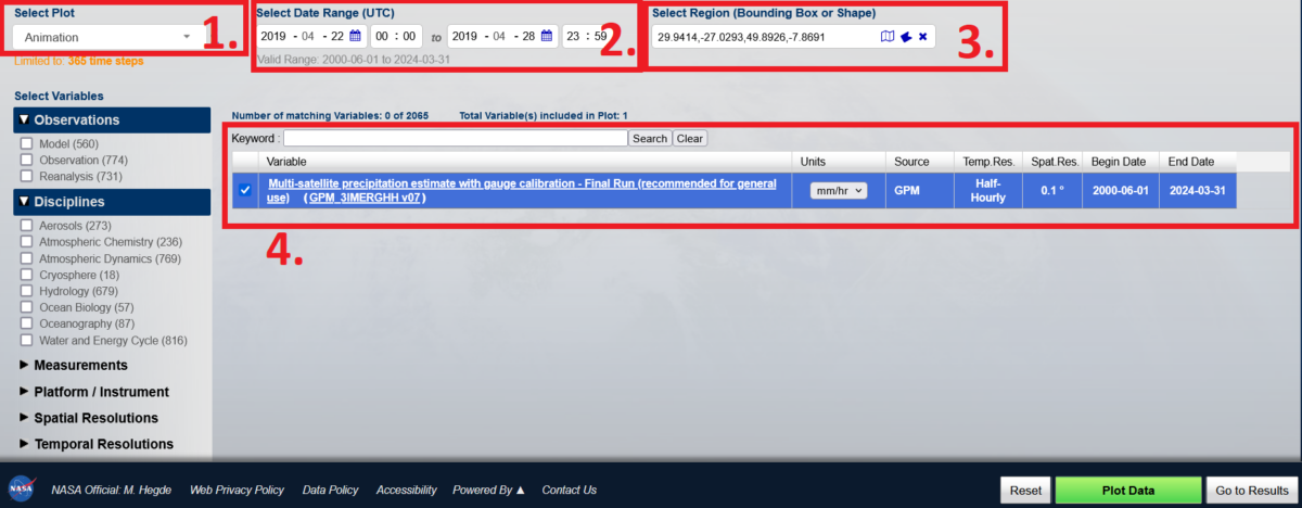
Define data specifics (see red boxes below):
- Select Plot: Animation
- Select Data Range: 2019-04-22 to 2019-04-28
- Select Region: All of Mozambique
- Select data set: Merged satellite-gauge precipitation estimate – Final Run (recommended for general use) (GPM_3IMERGM v07) Units: mm/hour. Source: GPM
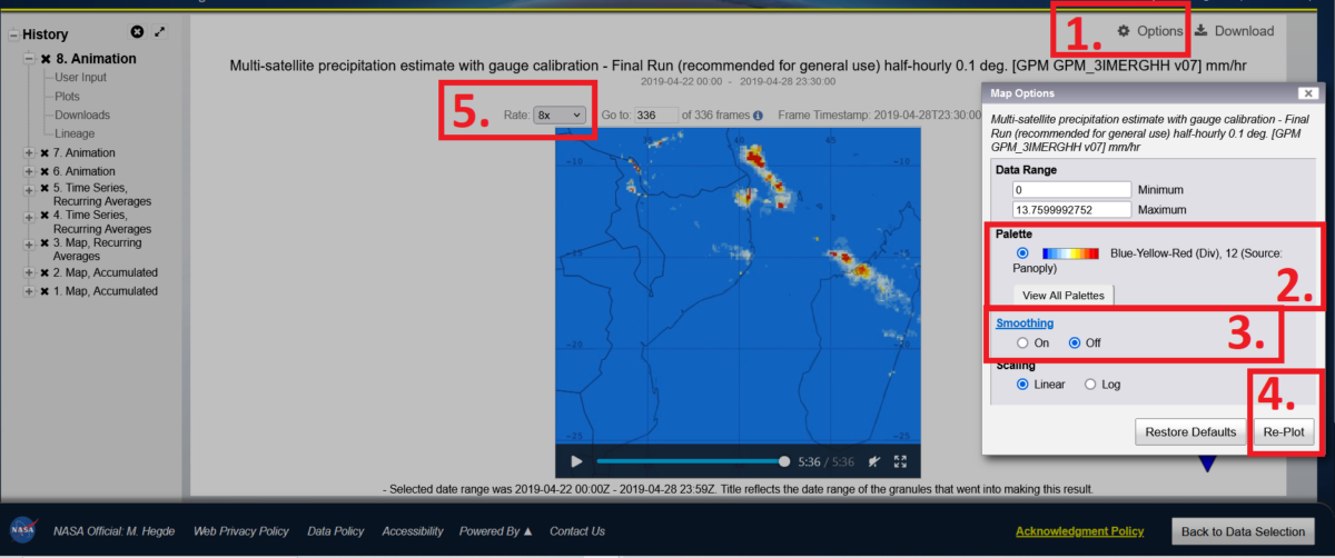
Customise:
- Select Options
- Select Palette: Cyan-Red-Yellow (Seq), 65
- Turn Smoothing ‘On‘
- Select Re-Plot
- Set Rate to 8x
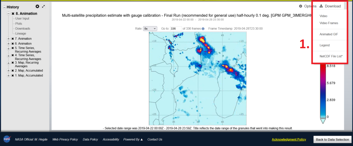
Export Graph
- Select Download and file type. Select either Video or Animated GIF.
Note: Recently, when downloading the animation, the set frame rate of 8x was not maintained but reset to 1x. To readjust the frame speed, open the file in a video or GIF editor after downloading and adjust the speed settings.
Final Export
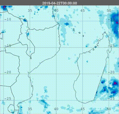
This animated graph above presents multi-satellite precipitation estimates (GPM_3IMERGHH v07) at a 0.1-degree resolution with half-hourly rainfall rates in mm, covering April 22 to 28, 2019. The animation clearly shows Cyclone Kenneth’s path, highlighting regions with the heaviest rainfall and providing insights into its development, progression, and dissipation.
Visualisation III: How Much Did It Rain and Where?
Creating a graph showing the accumulated daily mean precipitation across the region helps visualise the rainfall caused by Cyclone Kenneth across multiple days and pinpoint the areas that experienced the heaviest precipitation. (This export also sets you up for the next step, working with the data in maps, such as Google Earth Pro).
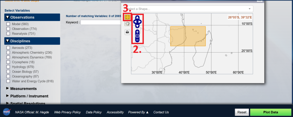
Select Region (see red boxes below)
- Click on Map Icon
- Zoom to Mozambique
- Use the Drawing Tool to highlight Cabo Delgado and the nearby ocean
- Close the ´Select Region´ window
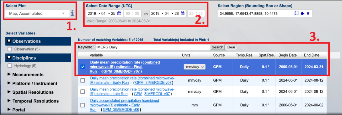
Define Data Specifics:
- Select Plot: Map, Accumulated
- Select Data Range: 2019-04-25 to 2019-04-28
- Choose your Precipitation Data Set by entering the keyword search field: ´GPM_3IMERGDF v07´. Select Daily mean precipitation rate (combined microwave-IR) estimate – Final Run (GPM_3IMERGDF v07)
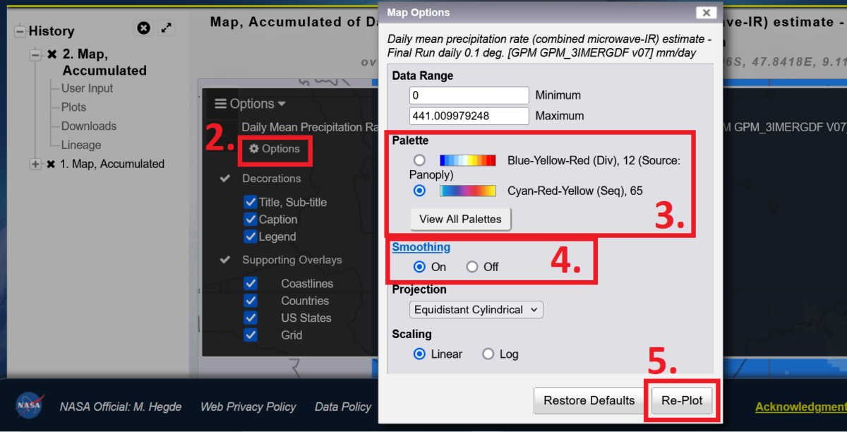
Customise:
- Select Options
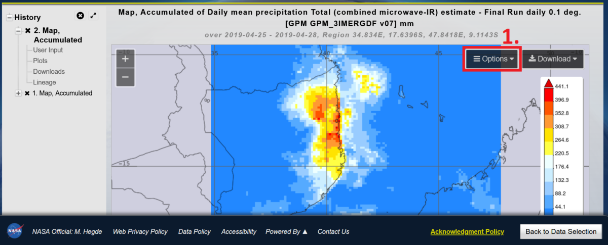
- Select Options within the Pop-Up Window
- Select Palette: Cyan-Red-Yellow (Seq), 65 (Select ‘View all Palettes’ to add this palette if it is not already shown)
- Turn Smoothing ‘On’
- Select Re-Plot
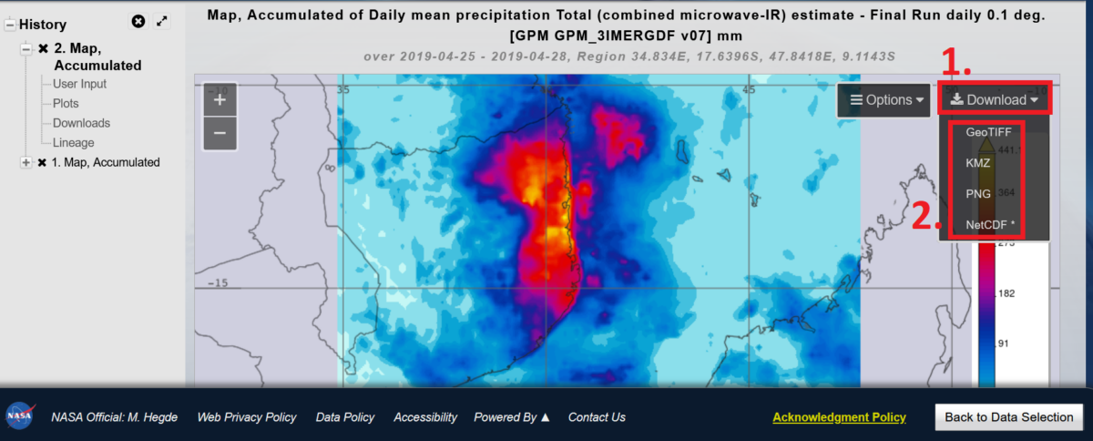
Export Visualisation:
- Select Download and export as an image (PNG) or as a KMZ for Google Earth and QGIS/ArcGIS.
Final Export
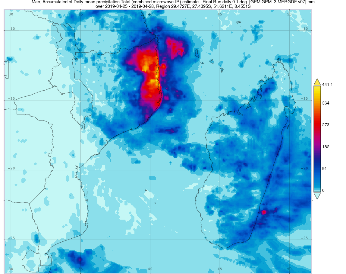
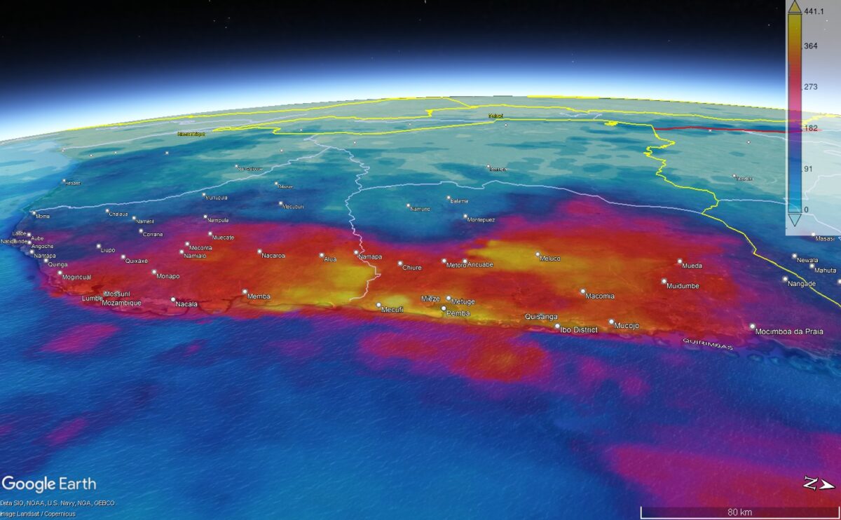
This map presents accumulated daily mean precipitation from April 25 to 28, 2019 using GPM IMERG data, which combines microwave and infrared satellite observations to estimate rainfall at a 0.1-degree resolution.
“Accumulated daily mean precipitation” refers to the total rainfall recorded each day, averaged over the given time period. This approach provides a clearer picture of sustained rainfall intensity rather than isolated events. By visualising this data, we can identify the regions that experienced the heaviest rainfall, which are often the most affected by secondary hazards like flooding and landslides.
Plotting Climate Data as Maps
While NASA Giovanni enables direct graph generation, integrating its data into mapping software provides deeper insights by placing climate impacts in the context of local geography. By visualising climate data like rainfall rates alongside roads, settlements, and topography, you can create customised maps that reveal meaningful patterns.
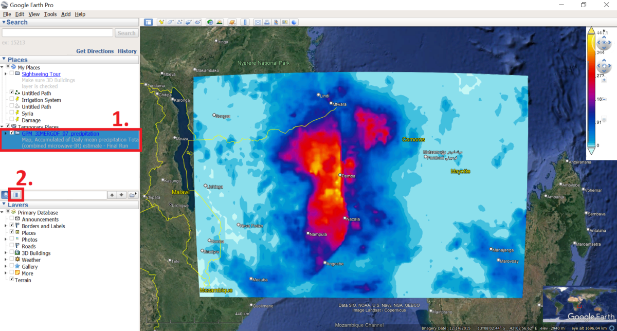
To get started, download and install Google Earth Pro Desktop. Then in NASA Giovanni, export the previously created accumulated rainfall map as a KMZ file. Open the KMZ file in Google Earth Pro. If the file does not open automatically, open Google Earth Pro Desktop and drag and drop the downloaded KMZ file anywhere on the map.
Customise: (see red boxes below)
- Select the added file.
- Select the icon to adjust Opacity and set the layer to transparency.
To export, as shown in the following video, use the mouse cursor to adjust the view. Finally select the Save Image icon to export the map view as an image file.
Final Export:
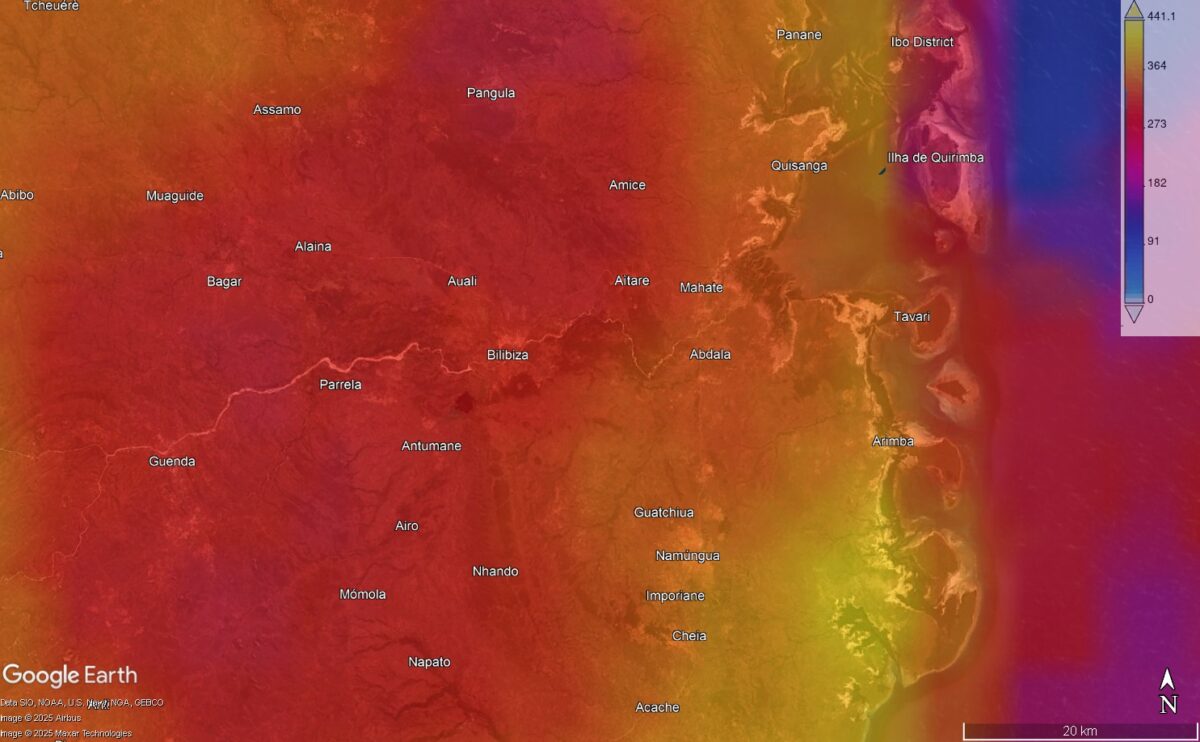
Visualising the accumulated rainfall layer in Google Earth Pro brings the data to life by showing how precipitation patterns interact with the landscape. The overlay makes it clear how rainfall intensity surged as rain clouds moved inland from the coast, revealing the influence of topography and weather systems.
By placing the data alongside roads, settlements, and natural features, it becomes easier to see which areas experienced the heaviest rainfall and potential flooding. This added context transforms raw climate data into a powerful tool for understanding and communicating impacts on communities and infrastructure.
Visualising climate events isn’t just about creating maps; it’s about clarity. Through simple, accessible tools like NASA Giovanni, anyone – from researchers and journalists to humanitarian workers – can harness data to tell these urgent stories.
What Next?
This guide (Part 1 of 2) has shown how to access and visualise the climate component within the complex intersection of climate, conflict, and displacement. In Part 2, we will explore the conflict dimension – how to access open-source data on conflict incidents, filter and download relevant data types, and process them for visualisation in Google Earth Pro.
Find Out More
If you want to dive deeper into climate data and visualisations, explore these valuable resources:
- Copernicus Climate Data Store: A hub for high-quality climate datasets, including historical data, forecasts, and impact assessments.
- European Space Agency (ESA) Climate Change Initiative: Satellite-based climate observations covering essential climate variables.
- NASA Worldview: An interactive platform for real-time satellite imagery, helping visualise weather events, wildfires, floods, and more.
- NOAA Climate Data Online (CDO): Access a wide range of U.S. and global climate data, including storm events, temperature records, and drought indices.
- IPCC Interactive Atlas: Climate projections, historical data, and regional impacts from the Intergovernmental Panel on Climate Change.
- Global Precipitation Measurement (GPM) Mission: Real-time and historical global rainfall data, perfect for mapping storm impacts.
These platforms offer free and accessible data to help you go beyond the surface and tell richer, data-driven stories about climate hazards and their human impacts.
Bellingcat is a non-profit and the ability to carry out our work is dependent on the kind support of individual donors. If you would like to support our work, you can do so here. You can also subscribe to our Patreon channel here. Subscribe to our Newsletter and follow us on Bluesky here and Mastodon here.