What Restaurants and Maps Can Tell us About Billions of Dollars of Covid-19 Relief Funds
In the wake of the first wave of coronavirus and subsequent lockdowns in early 2020, governments around the world scrambled funds to support furloughed workers and keep businesses afloat. These programs distributed a huge amount of money and succeeded in many of their goals. Not only that, they did so in rapid time. However, as governments have begun to release detailed information about relief aid, indications of geographic inequities in some programs appear to have emerged. In others, data appears to point toward interesting demographic and economic trends. To better understand these patterns, the Bellingcat Tech Team has created interactive maps of coronavirus aid programs in three countries: the United States, France and the United Kingdom, using sector-specific data to facilitate geographic comparisons where possible.
In the United States, data suggests the chaotic rollout of the Paycheck Protection Program (PPP) could have exacerbated existing inequality. For example, restaurants in neighborhoods in some cities, including New York and Los Angeles, appear to have had access to 20 times more funds than comparable neighbors. Restaurants were used in our analysis to make disparate regions of the US more comparable, because these businesses are common throughout the country. However, analysis suggests PPP inequalities extend beyond this sector. The vast differences in restaurants’ PPP uptake also appear to fall along existing racial and wealth divides in many neighborhoods, and are starkest in the most segregated cities.
In France, clear divides appeared visible between the north and south of the country, with the Chômage partiel system for furloughed worker support seeing significantly lower uptake in the south. Data on the “solidarity grant” program for small businesses and the self-employed seems to counter this trend, but it is smaller in scale, is non-recurring and may not provide equivalent financial stability. Data on restaurants and accomodation were used to tease trends from heterogeneous data. While the French data did not appear to indicate demographic inequality, it did reveal a variety of fascinating trends.
In the United Kingdom, the Coronavirus Job Retention Scheme (CJRS) and Self Employment Income Support Scheme (SEISS) were introduced to compensate workers for lost income, while grant programs supported small businesses and the hospitality industry. Overall, geographic discrepancies in the CJRS and SEISS data appear to reflect existing economic disparities more so than racial ones. Yet the data also suggests that the business grant programs did not provide as much assistance to urban areas, many of which are majority minority.
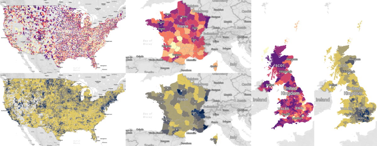
Maps detailing coronavirus aid program uptake rates and income in the United States, France, and the United Kingdom (Credit: Bellingcat/Logan Williams/Mapbox/OpenStreetMap).
The Bellingcat Tech Team focused on these three countries due to their transparency with open data, and this analysis does not necessarily generalize to other regions. While each country in this article also has additional relief programs, those chosen for analysis each have detailed geographic data available and together are some of the largest programs for furloughed workers and small businesses. We cannot point to causes for the geographic patterns we’ve observed, or know that they are not benign correlations with other factors, but think that the data for each country is multifaceted and rich nonetheless. Readers are encouraged to take a deeper look at areas they might know well or patterns that stand out in our interactive maps.
United States
In the United States, the primary form of coronavirus aid offered to small businesses and furloughed employees was known as the “Paycheck Protection Program.” This program offered loans to small and medium sized businesses. These loans were forgivable (that is, essentially grants) if certain conditions around spending the money on overhead and salaries were met. This program was implemented quickly and the rollout was widely criticized as confusing and chaotic. Businesses scrambled to find banks willing to process loan applications, and banks rushed to understand and meet governmental requirements. The first round of nearly $400 billion ran out quickly — in under two weeks. While the program was soon expanded with more funding, data released by the US Small Business Administration this summer shows that in some areas, businesses missed out.
In order to make disparate economic regions of the United States more comparable, Bellingcat analyzed the ability of restaurants to obtain PPP funds. While different regions of the United States and different neighborhoods within cities have very different economic specialties, restaurants are almost everywhere. Additionally, this economic sector was uniformly hard hit by coronavirus-related closures and customer loss. Using data from the US Census’ ZIP Code Business Patterns dataset, a baseline can be established of the number of foodservice businesses in a particular ZIP Code. Then, the number of loans applied for through PPP can be counted for each ZIP Code, establishing the percentage of businesses that were able to utilize the PPP loans.
These percentages are only approximate, as the SBA dataset contains only applications, not approvals (though approvals were generally quite high, around 90%.) Additionally, because the latest ZCBP data was from 2018, these percentages exceed 100% in a small number of ZIP Codes (2%) where more restaurants applied for loans than were counted by the census, hence the 225% figure in the maps below. Corporate addresses for companies that own multiple restaurants over several ZIP Codes also led to some percentages exceeding 100%. Despite this necessary inaccuracy, the data shows what appear to be concerning trends in geographic equity.
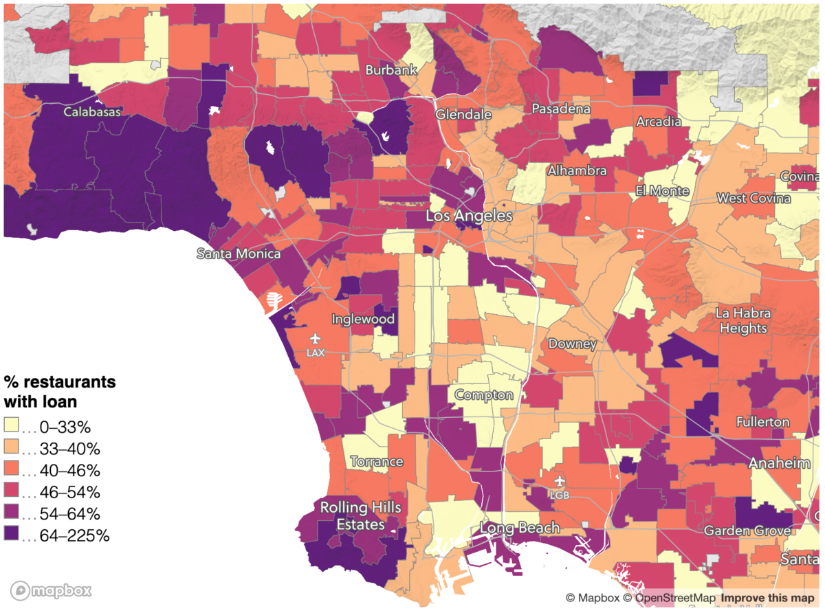
A map of the percentage of restaurants that applied for PPP loans in ZIP Codes in Los Angeles, based on SBA and census data (Credit: Bellingcat/Logan Williams/Mapbox/OpenStreetMap).
Looking at the city of Los Angeles, the data shows that restaurants in certain neighborhoods, such as the Hollywood Hills, had generous access to PPP loans, while establishments in other neighborhoods, particularly around South Central Los Angeles, had far fewer loans. These areas are also much less wealthy and much less white, as we can see using data from the 2015-2019 American Community Survey five-year estimates.
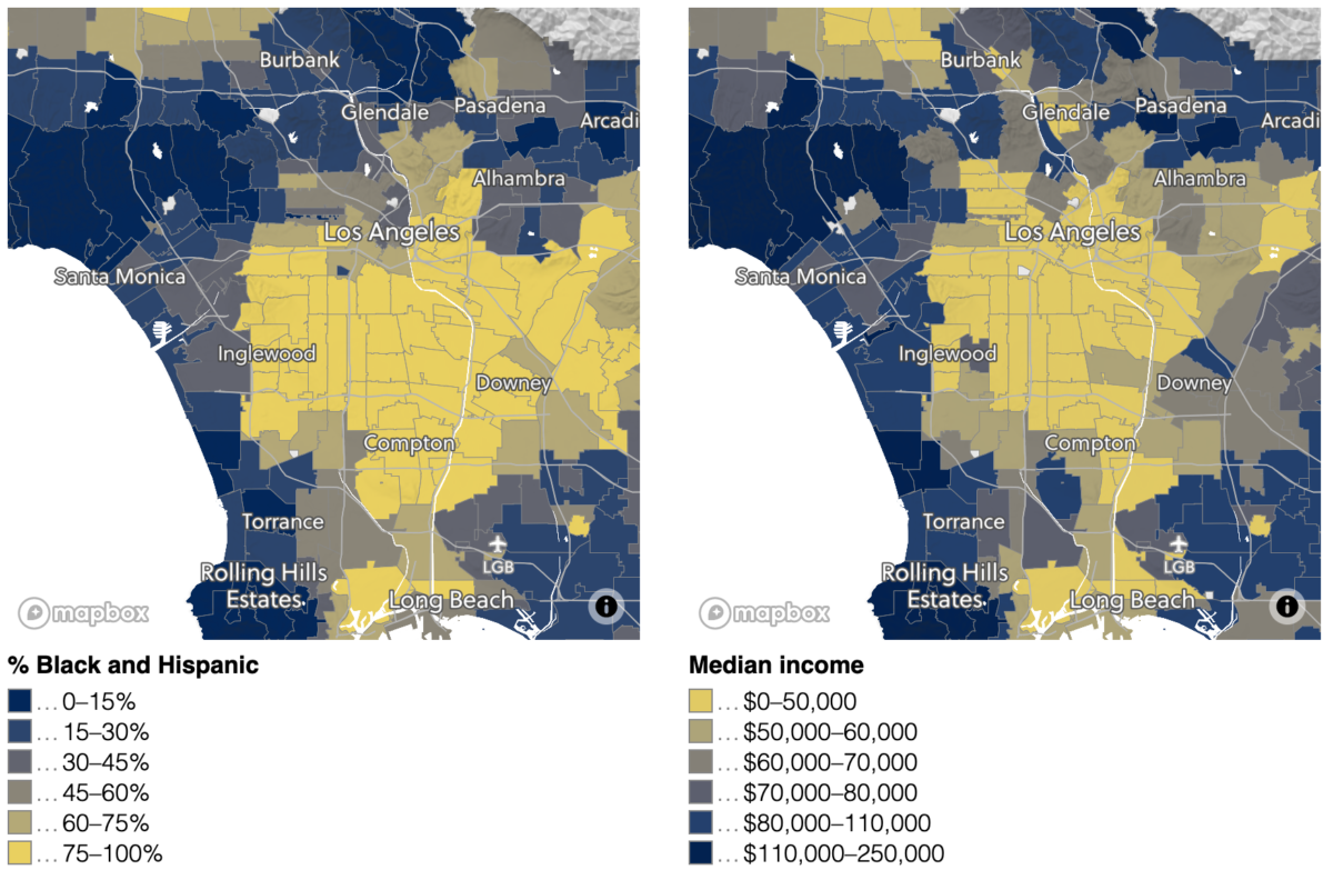
Left: A map of the Black and Hispanic population by ZIP Code in Los Angeles. Right: A map of median income by ZIP Code in Los Angeles (Credit: Bellingcat/Logan Williams/Mapbox/OpenStreetMap).
Across the entirety of the United States, large scale patterns are somewhat difficult to discern — while the average restaurant loan access rate is slightly different from state to state, these do not correlate with geographic regions, political party power, or demographic differences. However, the local scale patterns of geographic inequity seen in Los Angeles seem to be replicated across the United States from New York to Houston.
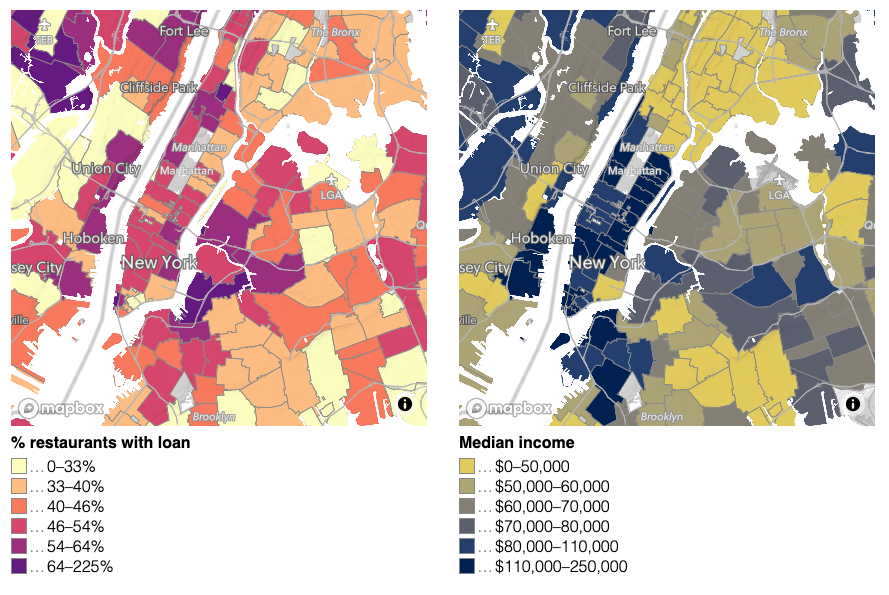
Median income and restaurant loan access in New York City. Lower income areas in New York City generally have a greater non-white population as well (Credit: Bellingcat/Logan Williams/Mapbox/OpenStreetMap).
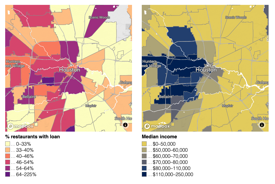
Median income and restaurant loan access in Houston. Lower income areas in Houston generally have a greater non-white population as well (Credit: Bellingcat/Logan Williams/Mapbox/OpenStreetMap).
To understand the relationships between ethnic makeup, income, and loan access, which certainly seem correlated from qualitative analysis of the maps, a simple trendline can be fitted to the data (ordinary least squares). A scatter plot of these relationships is shown below.
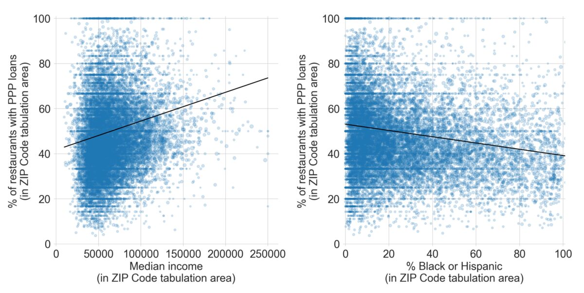
Left: The relationship between median income and loan access by ZIP code for restaurants across the United States. Right: the relationship between the percent Black and Hispanic population and loan access by ZIP code for restaurants across the United States (Credit: Credit: Bellingcat/Logan Williams).
These are clearly imperfect correlations and there are many factors that affect the number of loans provided to a certain community, making the data quite noisy. However, these relationships are statistically significant (very unlikely to be caused by random chance) and quite strong. The average restaurant in a neighborhood with a median income of $30,000 has a 45% chance of having a PPP loan; in a neighborhood with a median income of $200,000, there is a 67% chance. Similarly, a 0% Black or Hispanic neighborhood has an average of 53%, whereas a neighborhood with 100% Black or Hispanic population averages 39%. In aggregate, these discrepancies add up to thousands of loans and hundreds of millions of dollars.
In certain states, these correlations are more clear. In California, where our dive into the PPP data began, racial demographics and income predict more than 13% of the overall variation in loan access rates to restaurants from ZIP Code to ZIP Code.
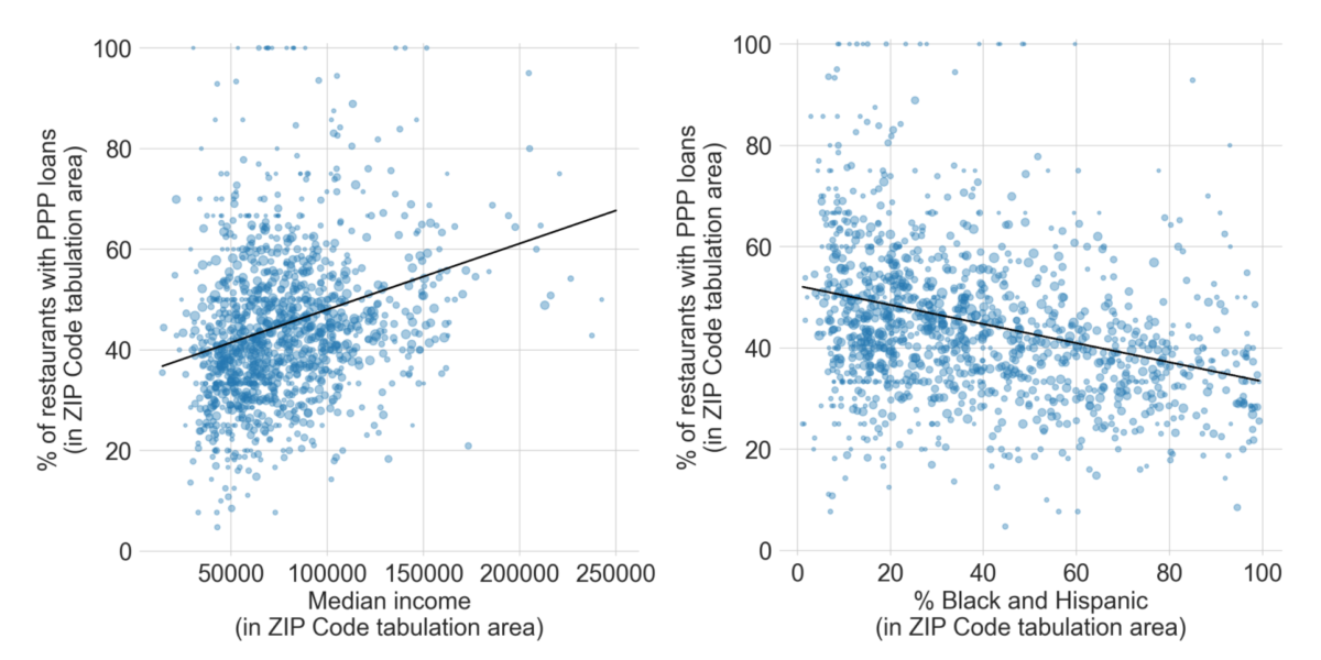
Left: The relationship between median income and loan access by ZIP Code for restaurants in California. Right: the relationship between the percent Black and Hispanic population and loan access by ZIP Code for restaurants in California (Credit: Bellingcat/Logan Williams).
Looking at each state individually, data shows there is also a statistically significant correlation between median income and the percentage of restaurants with PPP loan applications in 29 states and the District of Columbia. (In 21 states, noise in the data meant that there was a greater than 5% chance that the variation was due to random chance.) In every statistically significant relationship, restaurants in higher income areas had greater access to PPP loans, as emphasized in the graph below, where taller bars indicate that income was a better predictor of loan access (click on the image to enlarge graph).

Correlation between the ability of restaurants to access PPP loans and median income, by state. Taller bars indicate a more direct correlation with loan access, or that median income predicted loan access better. Darker colors indicate that differences in median income had a greater impact on loan access. Translucent bars are not statistically significant (Bellingcat/Logan Williams).
Furthermore, in 25 out of 52 states, there appears to be a statistically significant correlation between areas with greater Black and Hispanic populations and restaurant access to PPP loans. In every statistically significant case, this relationship is in the direction of reduced loan access, as can be seen in the graph below.

Correlation between the ability of restaurants to access PPP loans and the percentage of the population that is Black or Hispanic, by state. Taller bars indicate a more direct correlation with loan access, or that population demographics predicted loan access better. Darker colors indicate that differences in median income had a greater impact on loan access. Translucent bars are not statistically significant (Bellingcat/Logan Williams).
Data shows also that geographic equity is not similarly unequal across the United States — some states, such as Delaware and South Carolina, are clear outliers with more significant and severe correlations between loan access and racial demographics and income respectively. Not every demographic variable shows a significant correlation with loan access. For example, the percentage of the population that is Asian is only correlated with loan access in 10 states, and those are split between positive correlations and negative correlations.

Correlation between the ability of restaurants to access PPP loans and the percentage of the population that is Asian, by state. Taller bars indicate a more direct correlation with loan access, or that population demographics predicted loan access better. Darker colors indicate a stronger effect. Translucent bars are not statistically significant (Credit: Bellingcat/Logan Williams).
Similarly, while a handful of states show that restaurants in more rural areas had reduced access to loans, across the nation there is no obvious correlation between population density and loan access, and in some states the correlation is reversed.

Correlation between the ability of restaurants to access PPP loans and population density, by state. Taller bars indicate a more direct correlation with loan access, or that population density predicted loan access better. Darker colors indicate a stronger effect. Translucent bars are not statistically significant (Credit: Logan Williams).
None of these correlations between aid access and demography have been intentionally designed into the Paycheck Protection Program, to our knowledge. Instead, it is likely that this is a consequence of existing inequities across the United States. Majority-minority neighborhoods have less access to banking services necessary in order to apply for aid, and immigrant communities where English is less frequently spoken may have had more difficulties accessing information and materials about the program.
Regardless of the intent or cause of the disparity, the consequences are clear: restaurants in whiter and wealthier neighborhoods across the United States have greater access to economic resources through the Paycheck Protection Program for recovering quickly from the coronavirus recession. While this analysis can only draw conclusions for restaurants, similar PPP trends for other broadly-distributed businesses such as hair salons and retail stores suggest that this inequity might extend throughout the larger economy. However, the United States also introduced other coronavirus aid programs, including Extended Unemployment Benefits (EB) and “Main Street Loans,” and this analysis does not necessarily generalize to these programs as well. Explore the patterns in their full detail in the interactive map below, hosted with the support of the Mapbox Community team.
US Data Sources: PPP Loan Data released by the Small Business Administration (August 8, 2020), American Community Survey 5 Year Estimate (2015-2019), ZIP Code Business Patterns (2018)
France
In France, public data is available for two coronavirus aid programs, but only at the departmental level, which comprise areas much larger than US ZIP Codes. The first of these programs is Chômage partiel, a support program for furloughed workers. The second program is a grant system for businesses with fewer than 10 employees, independent contractors, and the self-employed. Because the geography of the French data is coarsely grained, and because France does not collect the same demographic data as the United States, less can be observed about inequity and access. Nonetheless, the patterns in program uptake point towards interesting economic trends.
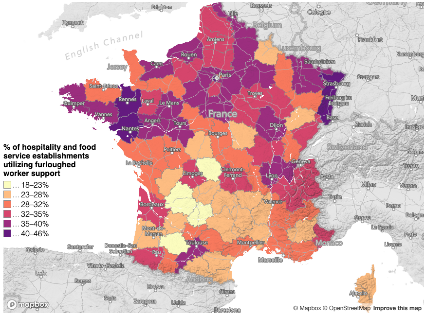
A map of the percentage of hospitality and food service establishments utilizing Chômage partiel, computed by dividing the number of establishments in this sector with Chômage partiel applications by the number of establishments in this sector in the Sirene business database (Credit: Bellingcat/Logan Williams/Mapbox/OpenStreetMap).
Mapping the percentage of hospitality and food service establishments that are using the furloughed worker support system shows a significant discrepancy between the north and south of France. Analogous to the analysis of the restaurant sector in the United States, mapping data for the hospitality sector alone helps minimizes confounding geographic factors.
This variation is dramatic (from 20% in the south to 40% in the north) and its geographic pattern does not appear to correlate directly with demographic and economic trends, including income, immigrant populations, unemployment. However, there might be a small correlation with population density.
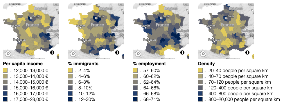
From left: per capita income, the percentage of the population that was born outside of France, the percentage of the working age population that is employed, and the population density, by department in France (Credit: Bellingcat/Logan Williams/Mapbox/OpenStreetMap).
What appears to be more broadly correlated is the per capita amount disbursed under the other big coronavirus aid program, the solidarity grants. Again restricting the analysis to the hospitality sector, the data shows that a much greater amount of money was distributed to businesses (including independent workers that have registered as a business) in the south than in the north, when normalized by the total number of hospitality workers.
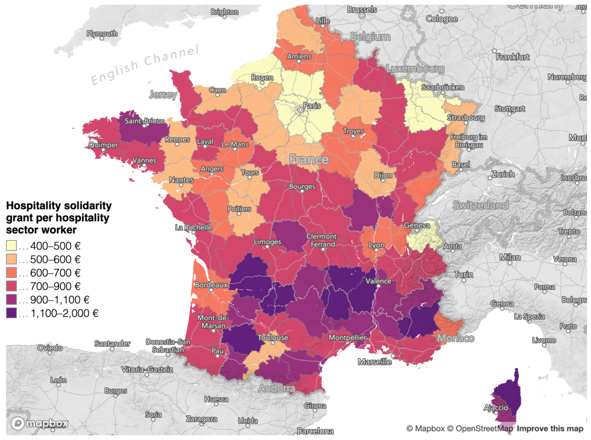
A map of the total hospitality solidarity grant value divided by the number of workers in the hospitality sector in each French department (Credit: Bellingcat/Logan Williams/Mapbox/OpenStreetMap).
A possible explanation for this is that only salaried employees are eligible for Chomage partiel. Employment statistics show that a greater proportion of workers in the south are not salaried employees, across both the hospitality sector and the economy at large.
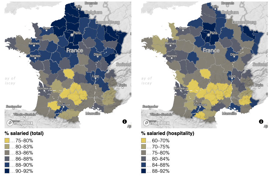
Left: the percentage of all workers that are salaried employees, by French department. Right: the percentage of hospitality and food service workers that are salaried employees, by French department (Credit: Bellingcat/Logan Williams/Mapbox/OpenStreetMap).
This relationship can be further confirmed by plotting the percentage of hospitality workers on salaried employment against the percentage of businesses utilizing the Chômage partiel scheme. The relationship is fairly clear, although there are some outliers. Paris, despite a relatively low percentage of salaried hospitality workers, has a very large Chômage partiel uptake rate. This could be because it was hit especially hard during the first wave of the coronavirus pandemic. Another outlier is the nearby (and much poorer) suburb of Seine-Saint-Denis, where despite a high salaried worker percentage, the uptake rate is lower than the average trend would suggest, perhaps due to a large number of essential workers who would not have been furloughed.
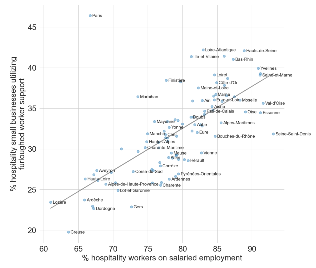
The relationship between the percentage of the hospitality workforce that is salaried and Chômage partiel uptake among hospitality businesses for each department in France (Credit: Bellingcat/Logan Williams).
While these two programs might appear to complement each other sufficiently, it is again worth keeping in mind the relative scale of each. Chômage partiel is a 31 billion EUR program, while the solidarity grants are only 5.6 billion EUR in size. Moreover, Chômage partiel provides recurring payments to qualified workers, while the solidarity grant is mostly a one-time check.
Other coronavirus aid programs exist in France that were not analyzed by the Bellingcat Tech Team, including support for arts organizations and tax relief. The programs might have different patterns of geographic equity and conclusions cannot necessarily be drawn about support overall. However, given the size of the programs analyzed, these observed patterns suggest that a deeper look at equity of aid programs could be helpful to ensure that no one is falling through the cracks.
As with the United States, data for these programs in France is available in the interactive map below.
French data sources: Business and establishment data from Sirene database, demographic and population data from 2017 INSEE census, data.gouv.fr releases on Chomage partiel and solidarity fund.
United Kingdom
In the United Kingdom, data was released on a number of coronavirus aid programs. These include the Coronavirus Job Retention Scheme (CJRS), which provides funds to companies to enable them to keep paying the salaries of furloughed workers, as well as the Self Employment Income Support Scheme (SEISS) and a number of other grants distributed to businesses. We will look at these programs in detail, beginning with the CJRS.
Widespread issues accessing this program largely seem to have been avoided. The uptake rate for eligible employees can therefore be assumed to mostly be correlated with the number of workers that needed to be furloughed due to lockdowns and the coronavirus crisis. Unlike in the data analyzed for the United States and France, the available data does not contain a detailed breakdown by economic sector, so it is important to note that CJRS analyses are for the entire economy. Despite that, the impact on the UK’s hospitality sector, which includes bars and restaurants, remains relatively easy to discern.
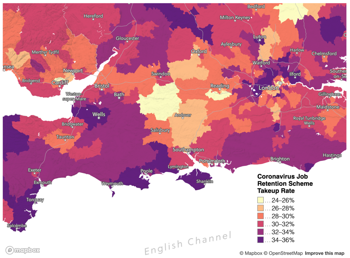
Using the slice of southern England pictured above by way of example, there are two types of place that stick out as having especially high CJRS uptake rates: suburbs near London, particularly to the north, and the coastal regions of south west England.
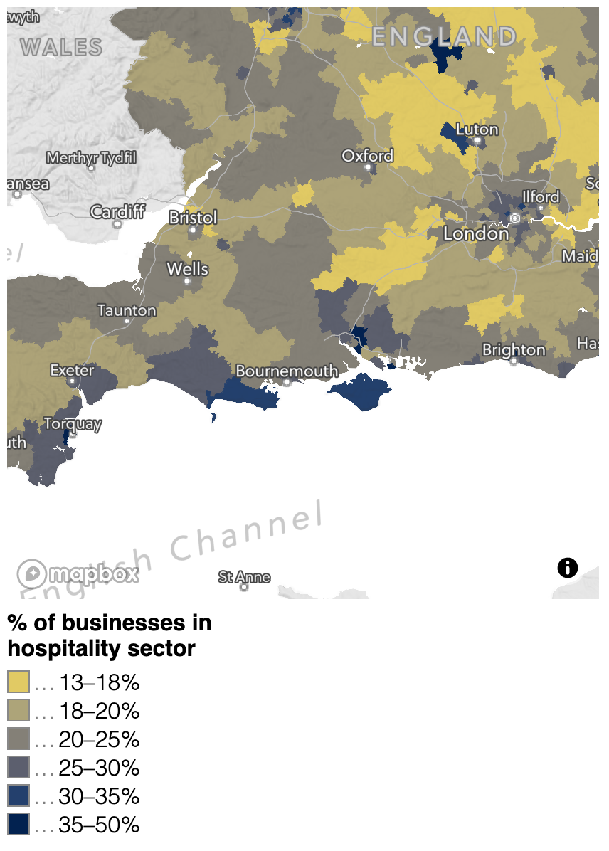
Looking more closely at this selected geographic area, three main demographic and economic trends appear to show correlations. Firstly, as hinted above, in regions where the hospitality industry (restaurants and lodging) is a greater percentage of the economy, CJRS uptake rates appear higher. This is likely because that sector was disproportionately impacted by coronavirus, as data from the UK’s Office of National Statistics shows. London and the south west, particularly the coastal areas, appear to stand out in this regard.
Secondly, demographic trends show that the suburbs of London have higher proportions of people of Asian descent. Several areas with high percentages of Asian residents, for example to the east of London around Ilford, also correlate well with high CJRS takeup rate. Finally, both the inner London suburbs and the rural south west have average incomes below other regions.
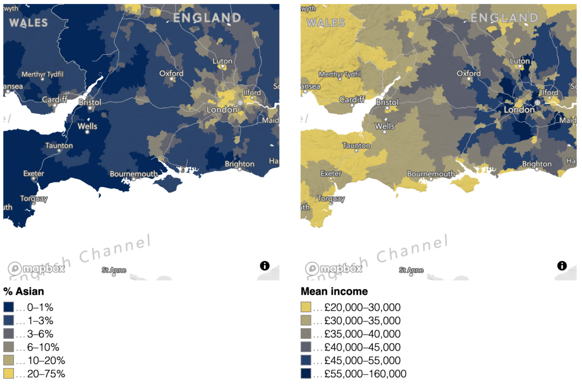
Top right: the percentage of businesses in each region that are in the hospitality sector. Bottom left: the percentage of the population in each region that is of Asian descent. Bottom right: the mean income in each region (Credit: Bellingcat/Logan Williams).
Despite the local correlation observed above between the CJRS and the percentage of the population of Asian descent, the overall CJRS takeup rate trends appear to reflect economic disparities more so than racial ones.
For example, a parliamentary constituency with a 30% white population has a 31% furlough probability, compared to 34% for a 95% white constituency. On the other hand, higher income constituencies are much more likely to have lower CJRS uptake rates — this is not a surprise, since low-paying service industry jobs have been some of those most impacted by the coronavirus crisis.
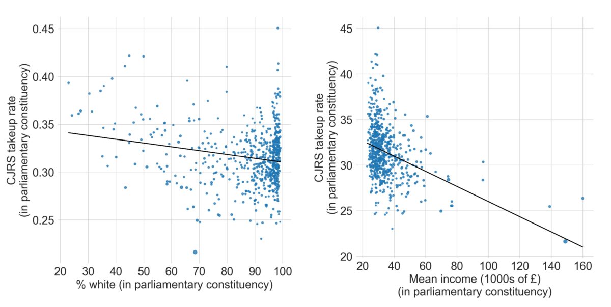
Left: the relationship between the CJRS takeup rate and the percentage of the population that is white, by parliamentary constituency. Right: the relationship between the CJRS takeup rate and mean income, by parliamentary constituency. Even without the high income outlier constituencies, the trend is very similar. (Credit: Bellingcat/Logan Williams).
In a similar vein to CJRS data, analysis of the Self Employment Income Support Scheme (SEISS) shows geographic parallels in terms of uptake rates. SEISS applications are highest in the suburbs of London, indicating that a greater percentage of self-employed workers received aid through this program in those areas. Unlike the CJRS data however, there is a strong correlation with population density, possibly due to the prevalence of gig economy jobs in urban areas, that somewhat overshadows coastal regions.
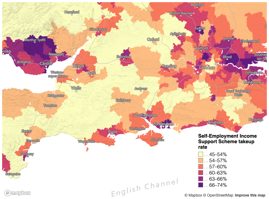
The percentage of eligible self-employed workers that utilized the Self-Employment Income Support Scheme (the SEISS takeup rate) in South Western England and parts of Wales (Bellingcat/Mapbox/Logan Williams).
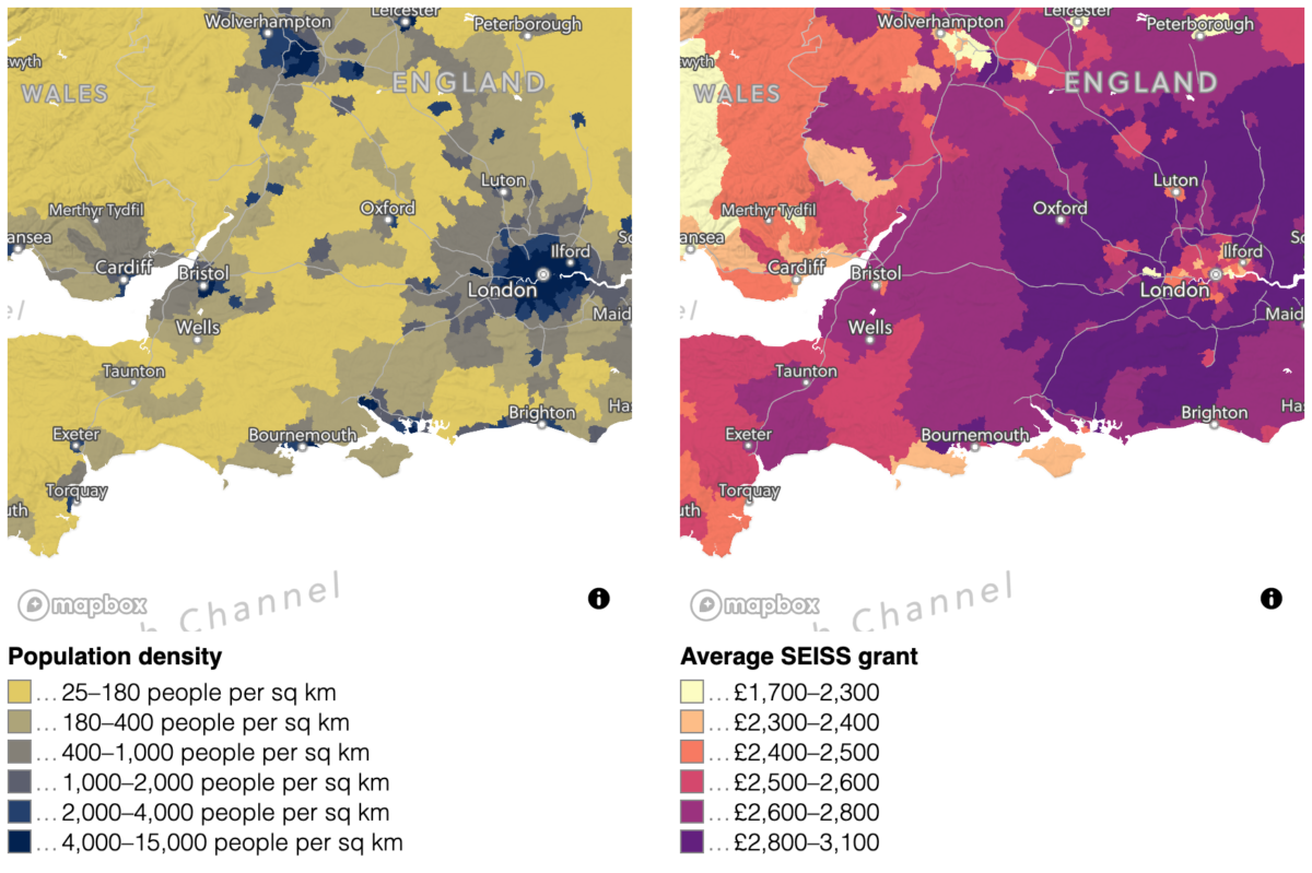
Left: the population density by parliamentary constituency. Right: the average SEISS grant value by parliamentary constituency. SEISS grant value is based on previous years’ income, so it shows an expected correlation with mean income and is highest in a ring around London (Bellingcat/Logan Williams/Mapbox/OpenStreetMap).
Trends in SEISS takeup data for the entire country also reflect similar patterns to CJRS.
As such, there appeared to be little correlation with racial demographics, but a stronger correlation with income, and an additional strong dependence on population density as previously noted
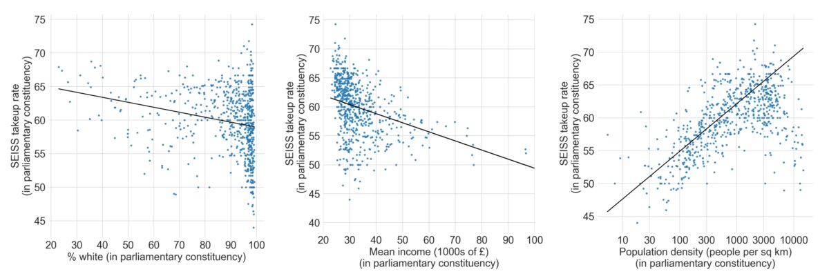
Left: the relationship between the SEISS takeup rate and the percentage of the population that is white, by parliamentary constituency. Center: the relationship between the SEISS takeup rate and mean household income, by parliamentary constituency. Right: the relationship between the SEISS takeup rate and the population density of each parliamentary constituency. (Credit: Bellingcat/Logan Williams)
However, correlations with racial demographics were more obvious in one UK coronavirus support scheme analysed by the Bellingcat Tech Team. This was the system of business support grants distributed at the local level to provide relief for businesses directly. This included the “Small Business Grant Fund,” the “Retail, Hospitality and Leisure Grant Fund” and funds distributed at the discretion of local authorities.
Naturally, it might be expected that such relief packages would correlate with areas that have high uptake rates in the other programs, as those are the areas likely to be economically hardest hit by coronavirus.
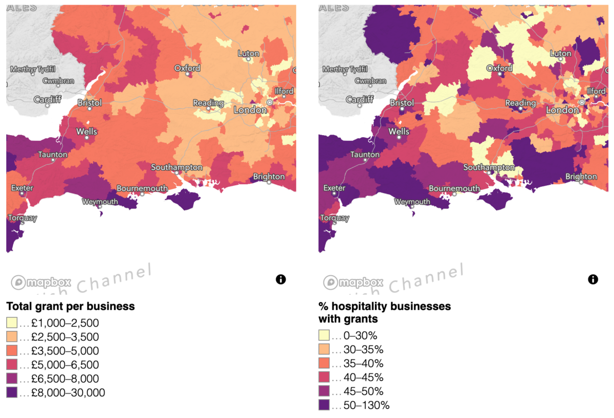
Left: total coronavirus business grant value (all three categories) divided by the number of businesses in each parliamentary constituency. Right: the number of Retail, Hospitality, and Leisure grants awarded divided by the number of businesses in those sectors in each parliamentary constituency. Business data is from the most recent 2011 census, and where more grants have been awarded than businesses counted in 2011, the number exceeds 100% (Credit: Bellingcat/Logan Williams/Mapbox/OpenStreetMap).
But that is not quite what the data shows. Instead, while coastal regions in the south west received relatively large amounts of aid through these grant programs, the urban suburbs, where there were larger minority populations, did not. Dividing the number of grant recipients by the total number of businesses in the retail, hospitality, and leisure sectors, an approximate percentage of these types of businesses receiving grant funds can be calculated. This value is quite high in the south west, especially along the coast, but is not very high near London, again, where there is a larger non-white population, even in areas with large numbers of businesses in this sector. Similar to the analysis of restaurants in the United States, by looking at the “Retail, Hospitality, and Leisure Grant” data, which supports a broadly distributed economic sector, we can make better geographic comparisons. These geographic differences are similar to results in the United States that showed significant variation in the ability of restaurants to access loans.
It must be noted that, also like the US analysis, the number of businesses is based on the most recent census count, in this case from 2011. Because of this, the data is only approximate, and in some cases exceeds 100%.
Yet across England as a whole, these grant programs appeared to show a more significant correlation with racial demographics than the CJRS or SEISS data. While we cannot know for certain that this is not a spurious relationship with other factors, the data nonetheless suggests a concerning inequity in grant distribution outcome.

Left: the relationship between the total grant value (all three categories), normalized by the number of businesses in each parliamentary constituency and the percentage of the population that is white in each parliamentary constituency. Right: the relationship between the local discretionary grant value, normalized by the number of businesses in each parliamentary constituency and the percentage of the population that is white in each parliamentary constituency (Credit: Bellingcat/Logan Williams).
For example, normalizing the amount of disbursed funds by the number of businesses in a parliamentary district shows that on average, whiter constituencies received more aid. This trend is even more severe when only the “local discretionary grants” are considered. Regions between 20% and 40% white received an average of £190,000 in total discretionary grants (£30 per business on average ), while regions with a population more than 90% white received an average of £540,000 (£141per business on average), an inequity between three and five times greater.
As with the United States, there are certain to be many intersecting causes for these trends, and no explicit or intentional bias in the disbursement of coronavirus aid is alleged. It is also important to consider the relative scale of these programs. The CJRS program is the largest, responsible for distributing £63 billion of funds in its first tranche. The SEISS program provided about £8 billion of assistance in total, and the local grants combined distributed about £11 billion to businesses. However, the local discretionary grants described above were responsible for only about £239 million of this. The UK also introduced other coronavirus aid programs not analyzed in this article, including tax relief and subsidized loan schemes that could have different patterns of geographic equity.
Explore the entire dataset and all variables in the interactive map below (some variables are only available for England).
UK Data Sources: Coronavirus business grant funding by parliamentary constituency and local authority (August 2020), Self-Employment Income Support Scheme statistics (September 2020), Coronavirus Job Retention Scheme statistics (August 2020), UK Census 2011.
Download our data
The coronavirus economic crisis had different impacts on different regions, so a non-uniform distribution of aid is expected. However, many aid programs show concerning disparities across comparable geographic regions. This is especially true in the United States, where Paycheck Protection Program loans made to restaurants appear to have provided significantly more per-capita relief to wealthier and whiter neighborhoods, even within the same metropolitan area. Smaller programs analyzed in the United Kingdom and in France show less stark inequities, but still point to places that might not have the same access to economic stabilization programs.
Bellingcat is making available the aggregated statistical and open data used for visualization in this article on our Github. As a second wave of coronavirus advances in Europe and the United States, bringing with it the possibility of a second economic lockdown, understanding where the first round of coronavirus aid fell short is important to ensuring that future programs provide equal access to relief.
The Bellingcat Tech Team develops tools for open source investigations and explores tech-focused research techniques. It consists of Johanna Wild, Aiganysh Aidarbekova and Logan Williams. Do you have a question about applying these methods or tools to your own research, or an interest in collaborating? Contact us here.
